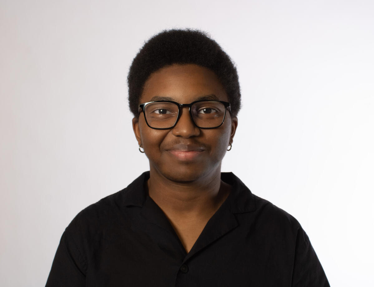
Welcome to my portfolio! Here is a collection of the projects I've contributed to and the personal artwork I've done.I'm Roman Sailes, a student at Cal Poly Pomona pursuing a B.F.A. in Visual Communication Design. My work primarily focuses on graphic design, and I’m interested in gaining real-world experience across different areas of design. I approach projects with curiosity and a willingness to experiment, always looking for new ways to strengthen my skills.I'm always open to connect with fellow creatives and collaborators who share a passion for delivering quality visuals and sharing their creativity with the world.If you like what you see, feel free to send a message or email!
Let's Connect!
Experience
Roles
Visual Communication Design (B.F.A), Cal Poly Pomona (2028)
Marketing Director, Game Development Club (2025-2026)
Marketing Director, SWIFT (2026)
Junior Graphic Designer, ASI (2025-Present)
Software
Adobe After Effects, Illustrator, Indesign, Photoshop, Premiere Pro
Canva
Clip Studio Paint
Figma
Procreate
Coursework
Foundations in 2D Design: Learned the elements and principles of design. Applied both in class and personal projects.
Foundations in 5D Design: Created wireframes and site prototypes. Designed websites using Figma and from scratch in HTML.
Typography: Learned about typographic terms, hierarchy in type.
Digital Photography: Learned the fundamentals of photography, edited photos through Adobe Lightroom and Photoshop. Used original photos in design projects.
Illustration
2026


2025


2024


2023


Graphic Design
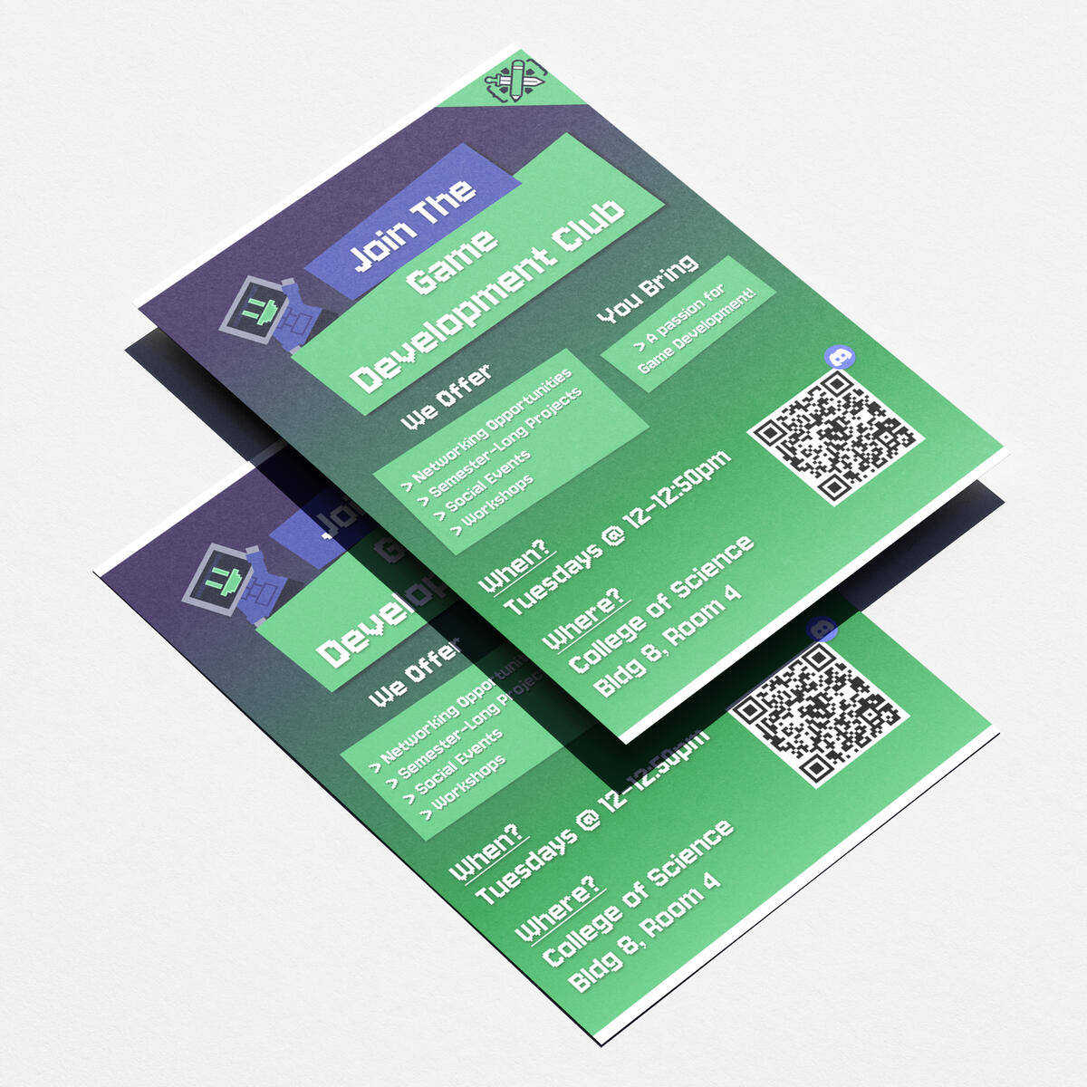
CPP | Game Development Club
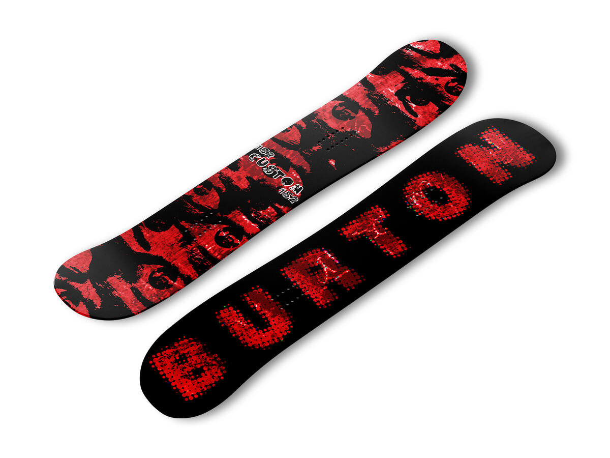
Typography | Snowboard Design
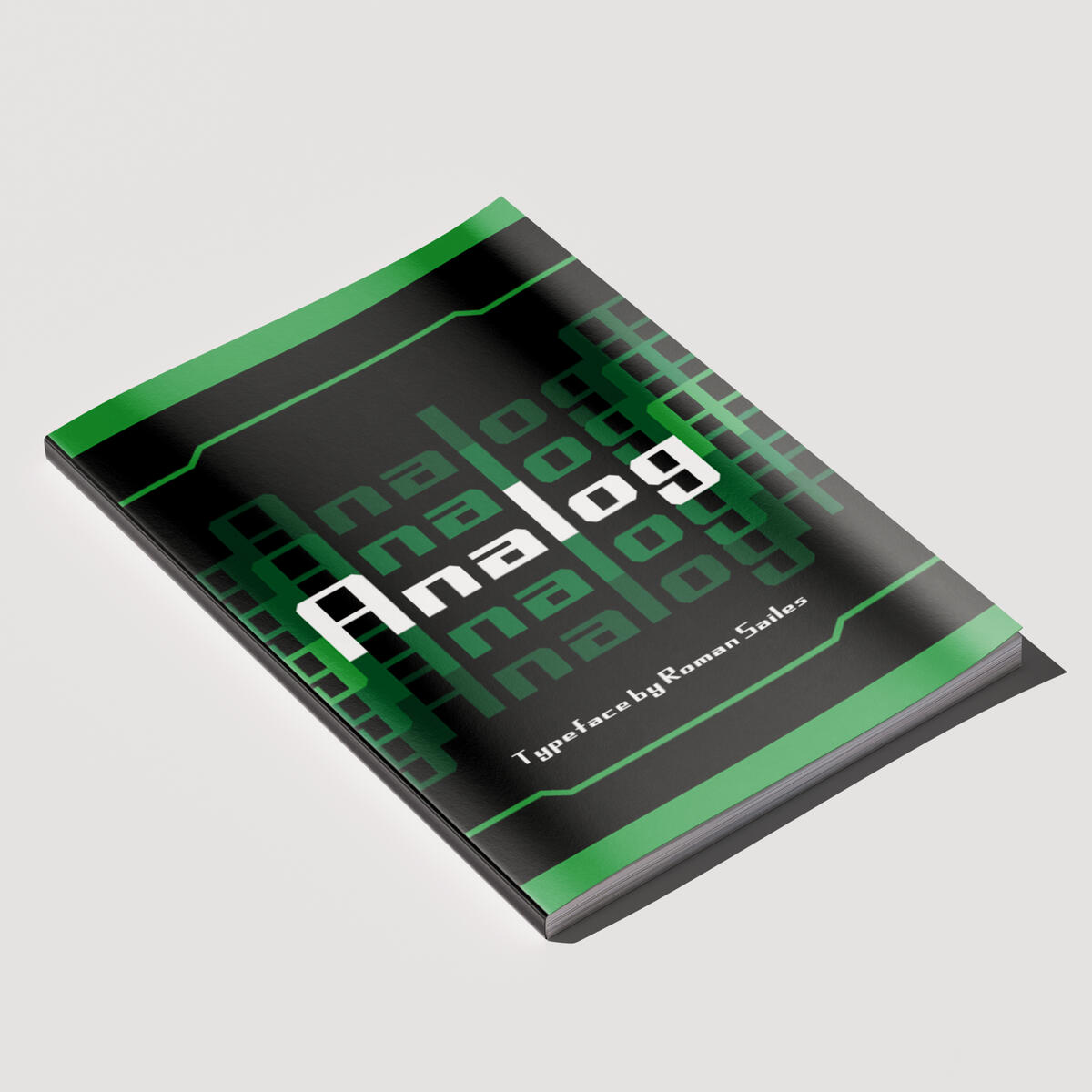
Typography | Analog Booklet
ASI | 2026 Coloring Page
Louder Than Life (Unofficial) | Poster Exploration
Louder Than Life (Unofficial) | Poster Exploration
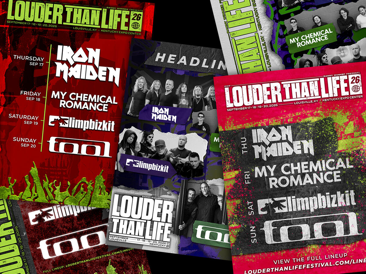
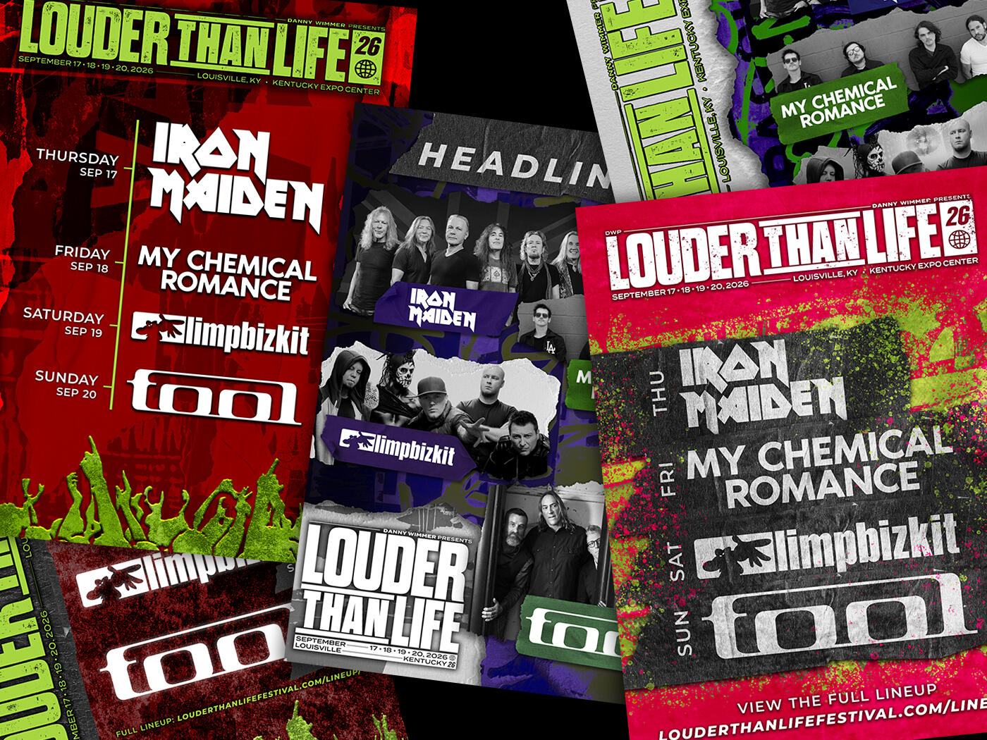
This project was inspired by the Louder Than Life music festival’s poster contest. I used the specifications they provided, along with their logo files.Brief: Must feature the 4 headliners (Iron Maiden, Limp BizKit, My Chemical Romance, Tool) and the title of the event.Specifications: 18x24 in., 300 DPI
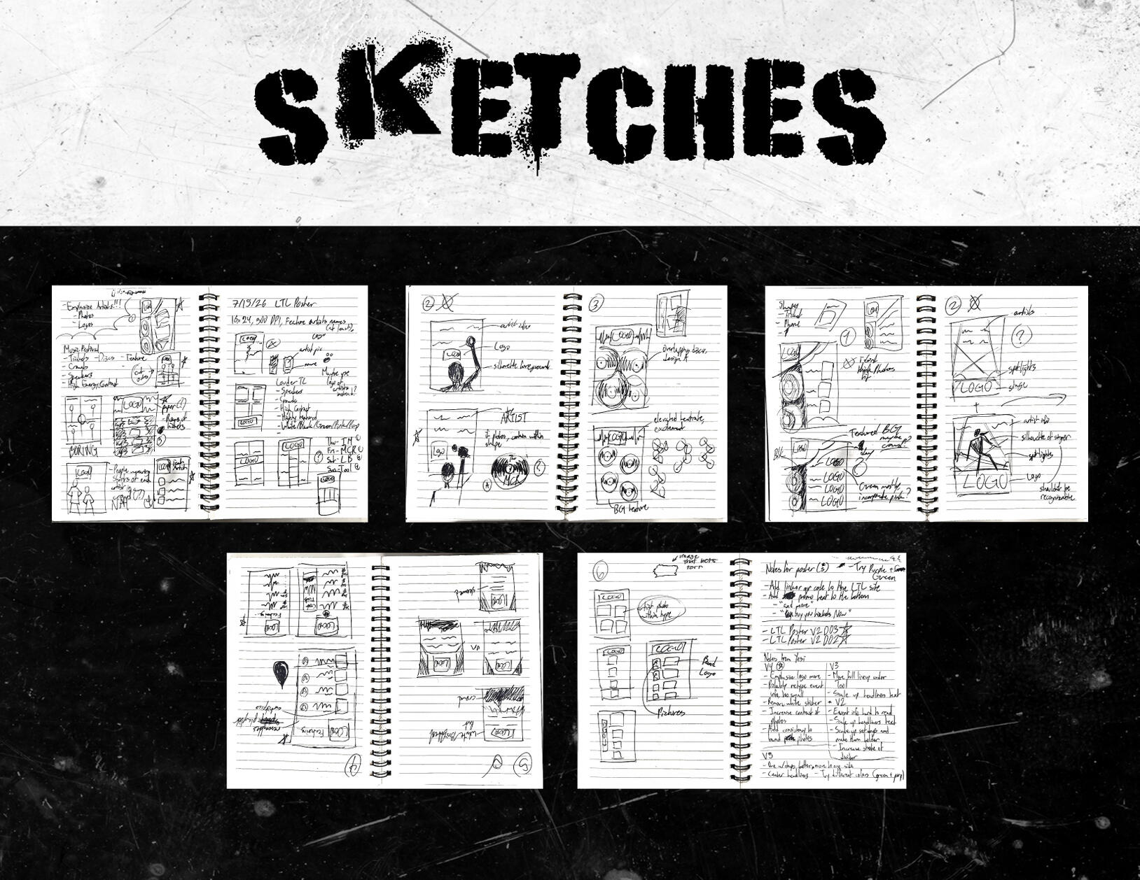
I traditionally sketched out layouts and compositions for the posters. This allowed me to not concern myself with cleanliness just yet and get my ideas out.I kept thumbnails simple enough to understand and with plenty of room to adjust. The ones with stars next to them were ones I preferred and that received the most positive feedback from my peers.


When I moved to digitally creating the posters on Adobe Photoshop, I used the LTL instagram page for inspiration on colors, assets to choose, and style. By maintaining a constant feedback loop between myself and fellow designers, I reached a final product that I was proud to share with the public.
Photography | Sweet Sip: Recipe Zine
talk about rezipe zine
* For a better experience, view on desktop.
Typography | Typeface Design
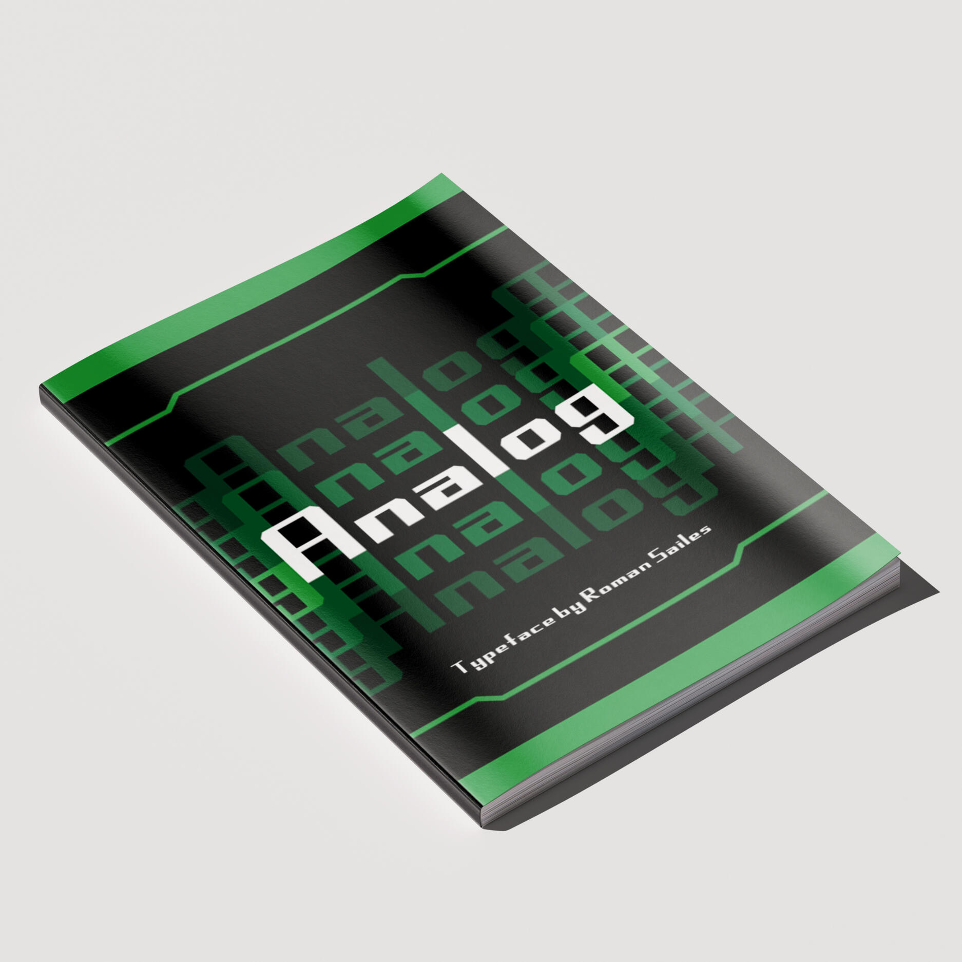
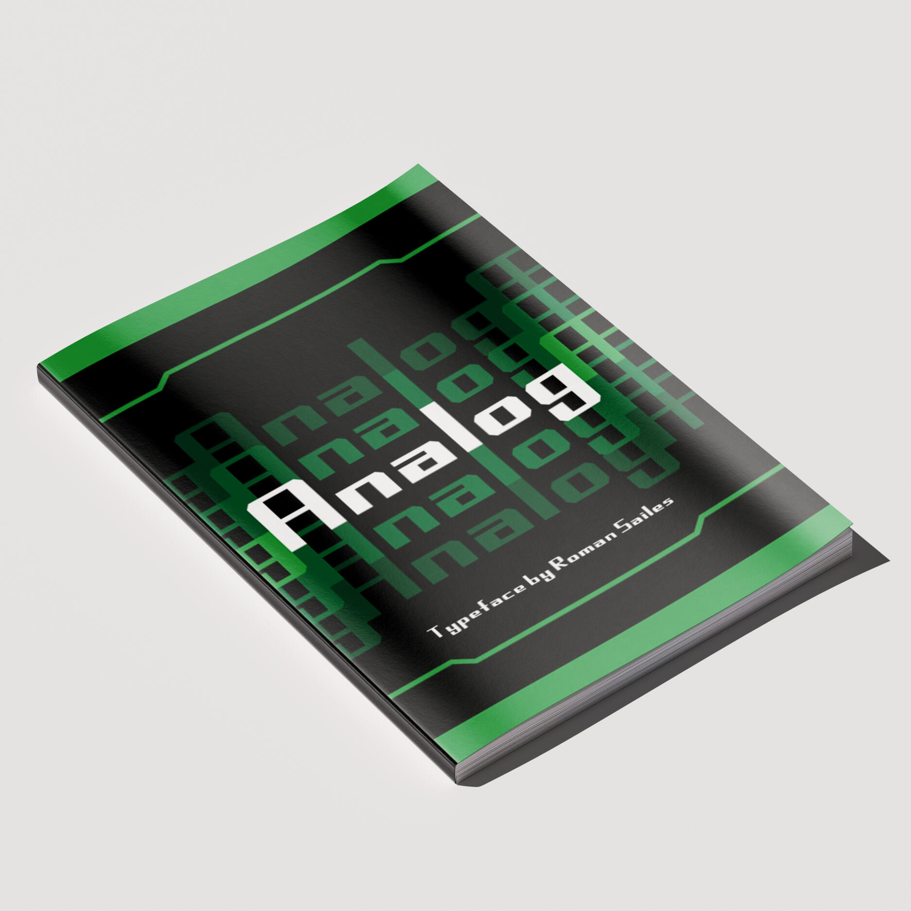
This project consisted of two parts: designing a typeface, then presenting that typeface in a booklet form as our final project of the semester.
For the first half of this project, we used a website called Fontstruct to create a typeface. The style of the typeface was entirely our choice, as long as it was legible. I decided on a sans-serif typeface because that classification of type is most often used due to its readability.
For the second half of this project, I gathered inspiration from digital clocks and old-school technology to find the style of the booklet. Our limits regarding color were white, black, and shades of a color of our choosing. I picked green as a primary color because of how digital clocks used it to display the time, and because it's often used when showing code in fictional movies.
* For a better experience, view on desktop.
ASI | 2026 Coloring Page
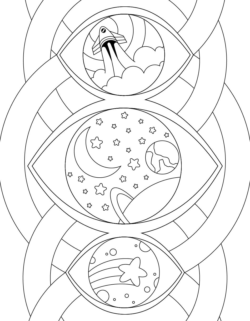
Every year, ASI has its designers work independently to create coloring page designs. These coloring pages are then added to the ASI journals given out to new students.
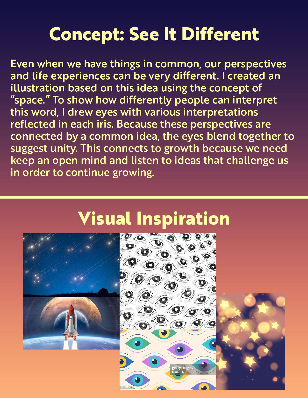
Our goal as designers were to create coloring pages that aligned with ASI's "Care and Growth" initiative. We first had to present a concept to our supervisors, and once approved, proceeded with creating the illustration as vectors in Adobe Illustrator.
I focused on bringing together the different perspectives held by our students, since everyone has their own story and life experience. Our sight is the main way we percieve the world.This design was included in ASI's yearly journals, which are given out to incoming Cal Poly Pomona students as a way of welcoming them to campus.


Typography | Snowboard Design
This was a group project where, after researching a design era, we had to create a snowboard based on that era. My group researched the grunge era, and decided to go with the theme of the parts that make a whole. I did eyes, while the other members did hands and mouths. We chose a RGB color scheme since each color works together to create all of the colors we see digitally.
This was later featured in the juried student exhibition PolyKroma during the Spring 2026 semester.


.
CPP Game Development Club | Marketing Director
I collaborated with the Social Media Director to design visually engaging, professional graphics that promoted the club and attracted new members. Social media posts were made using the meeting's topic as inspiration for the visuals. I designed the merchandise for the 2025-26 school year to be distributed to club members. I primarily used the programs Adobe Illustrator and Figma.


Motion Design
Motion Design Reel, Spring 2025
.
Web Design
Hi-Fi Wireframes


Game Projects
SPIN Halloween Game Jam: CATTLED (2025) | UI Artist
Illustrated the main menu screen, alongside UI elements such as buttons, inventory slots, and dialogue boxes.


SPIN Spring Game Jam: LEPRE-CON (2025) | Sprite Artist
I illustrated and animated enemy sprites and created player item art in Procreate. I collaborated closely with teammates through feedback on character designs, and critique.


CPP Game Development Club
The Internship (2025) | UI Artist
I worked with other artists and the team lead to ensure the web pages I designed had consistency with ones made by other artists.


Plague (2025) | Background Artist
I created the backgrounds for crafting and speaking with other characters. I illustrated the main menu screen and worked in Adobe Photoshop to design the game's logotype.


